


1
2
3
4
5
6
Artist Connect Case Study
Please click here or on image to view the full case study.
The artist life is not for the faint of heart. No research required for that one. With a murky path to steady income, the continual hustle required to get your work seen, improve your skills and refine your vision, success is an elusive target. With this knowledge as a starting point I set out to design a product that could help artists navigate the inherent challenges of their chosen profession.
Splash screen + main feed
Splash screen (left): Simple, interesting and quickly reinforces brand in the short time the user sees it.
Main feed (right): Displays many features informed by user research and UX principles. Please click here to view in more detail.
Posting flow 1
Ease of connecting addresses a primary user need. Users are encouraged to categorize their posts so others can easily find them, helping connect people around shared interests. Flow continues on next image.
View the full case study here.
Posting flow 2
The user selects the Promote Yo self! category (4) and fills in some details around her upcoming show (5). Her post is then featured on everyone’s feed because she has earned enough karma chips by supporting other users (6). The post gets a “featured” label as well as a graphic paint swipe behind it to help it stand out even more. The reasoning behind this feature was developed through extensive user research.
View the full case study here.
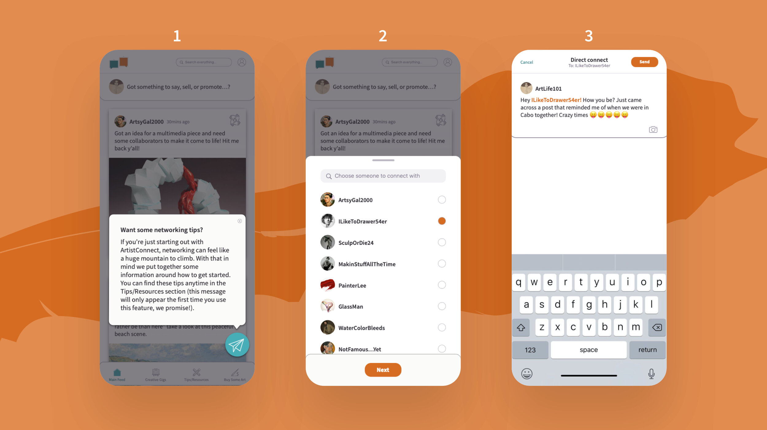
Direct connect flow
The user selects the Direct Connect button (1) and runs through the flow to connect with a contact (2) and write a message (3). If Direct Connect is being used for the first time, an encouraging pop-up appears informing the user where to find more information around networking and communicating successfully (1). This is in place to further address the user need of connecting with others as easily as possible.
View the full case study here.
Hit em back + profile + Search
The Hit em back feature (left) allows for quick engagement with a post, and the Profile screen (middle), encourages users to connect across platforms and give details about their history and work style. The more details provided, the more there is to connect around. The filters on the Search screen (right) align with posting categories to facilitate easy engagement with topics of interest.
View the full case study here.